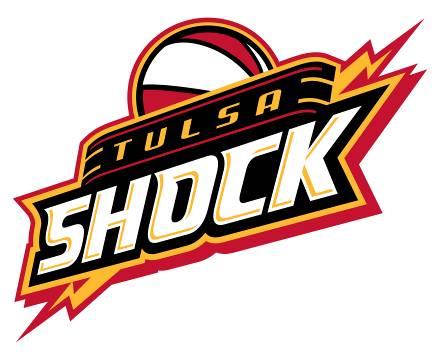
After months of anticipation, the new WNBA Tulsa franchise officially unveiled its identity today with the announcement of the new team name, logo and colors. The new franchise will be named the Tulsa Shock and its colors black, red and gold. The logo features a basketball on top of “Tulsa Shock” with a lightning bolt through it. The “Tulsa” lettering has an Art Deco inspiration which was influenced by the city’s rich history in Art Deco architecture.
The Tulsa Shock, formerly the Detroit Shock, moved to Tulsa in October 2009. In November, the team decided on a short list of three potential names which included Fire, Tempo and Shock and then gave the fans an opportunity to vote for their favorite on the team’s Web site – www.wnba.com/shock. The name “Shock” received the highest amount of votes with 38 percent. Tempo finished second with 32 percent and Fire was third with 30 percent.
The Shock’s new president, Steve Swetoha, believes the familiarity WNBA fans have with the Shock name will go a long way in developing brand recognition for the team and lends itself well to promotions and marketing opportunities.
“I think its clear the Shock name resonated with fans because of the championship history it invokes, as well as the feelings of speed and power it brings. Our new name and identity fits perfectly with the style of play Coach Richardson brings to the team,” Swetoha said. “It’s the same name with a whole new meaning.”
“The Tulsa Shock – I love it,” head coach Nolan Richardson said. “Having an identity gets me more excited because I know we’re one step closer to tip-off, and we’ll look good when that day comes.”
Tulsa Shock uniforms are not finalized at this time. The team will unveil the uniforms this spring.
 |